Multiple Windows in Hybrid React Desktop Apps #
Quip’s desktop apps are hybrid apps: both the Windows and Mac apps are composed of a web React-based UI talking to our C++ Syncer library, along with some platform-specific glue code. While this allows us to support two additional platforms with a small team we knew that architecting the apps in this way would run the risk of not “fitting in” with other Mac OS X or Windows applications.
To see if we could mitigate this problem, we started to enumerate what makes an app feel like “just a web view.” There were obvious things like responsiveness, working offline, and using platform conventions (e.g. a menu bar on the Mac). After thinking about it more, we also observed that native apps often have multiple windows, whereas web apps are bound to a single browser tab. This wasn’t just a matter of multiple windows showing Quip documents (something that did not seem too difficult to accomplish), but also all of the child windows that a native app would have (especially popovers and sheets on Mac OS X).
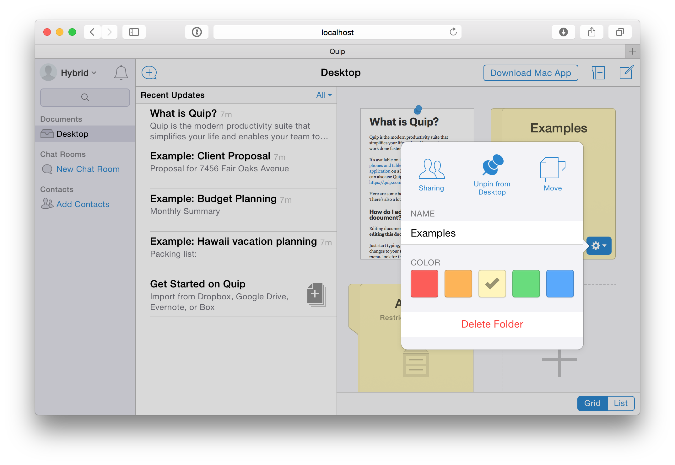
 We did have equivalents in our React “parts” library that we used in our website, but visually they didn’t match the native versions, and they felt very much bound by the enclosing rectangle of the web view. This was especially apparent with popovers that were triggered near the edge of the web view; one would expect them to “spill out” of the window but instead they would awkwardly position themselves “inward” to avoid getting clipped by the edges. This triggered an “uncanny valley” effect where the illusion of a native app would be broken.
All of this was very much on my mind about a year ago as I was building up the foundations of our desktop apps. Though seemingly just a “polish” kind of detail, it seemed like supporting child windows would require some design trade-offs that would be easier to make early on, rather than retrofit later. My first thought was that we should define all of the popover and dialog content in a very declarative manner, thus allowing to later change how they were rendered. For modal dialogs this worked pretty well, since their content tended to be pretty simple.
For example, a deletion confirmation dialog would be represented as:
parts.spec.newPanel()
    .addSection(parts.spec.newTitleSection(_("Delete Chat Room")))
    .addSection(parts.spec.newSection()
        .addMessage(_("If you delete this chat room, you will…")))
    .addSection(parts.spec.newSection()
        .addDefaultButton(_("Hide"), function() {
            ...
        })
        .addButton(_("Delete for all %(count)s people", {"count": count}), function() {
            ...
        })
        .addCancelButton(_("Cancel"), function() {}))
It was then a pretty straightforward mapping to generate an NSAlert instance that would fit right in on a Mac app (we support multiple modal dialog “runners”: one that creates a React version and another that passes it off to the platform native code).

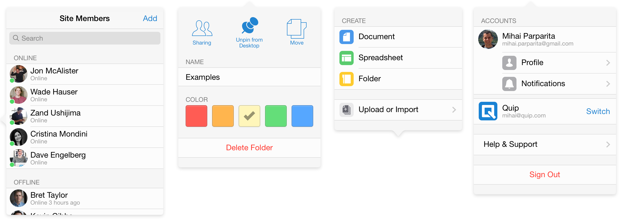
However, once we began to implement more and more popovers, the sheer variety of the kinds of controls used within them became apparent.

In addition to all these widgets popovers also often had custom validation logic (e.g. the “Create” button in the “New Folder” popovers is grayed out while the title is empty) and dynamic updates (rows representing users show presence). A declarative system would need to be quite complex in order to support all of these concepts. Furthermore, implementing each control multiple times was going to slow down development significantly, and the benefits seemed minimal (for example there are no platform conventions to follow for how to show a user row — that is a Quip-specific concept).
Since we already had a separation between the content of popovers and their frames (indeed, any React-based popover could be shown in a modal dialog instead), I wondered if it was possible to show the contents in a separate web view contained within an NSPopover instead. That way the frame would be native, and it could be positioned outside the main web view, but we would not have to re-implement all of our widgets.
To see if such an approach was feasible, I needed to answer two questions: “Could React render into another window?” and “Could we create another web view that was visible in the main window's JavaScript context?”
The reason why I wanted React to render into another window from the child was that this way all JavaScript execution would still happen in a single window, which would make this code path much more similar to regular popover rendering. To test this out, I tried something along these lines (in the web version of the app):
var otherWindow = window.open();
var container = otherWidow.document.createElement("div");
otherWindow.document.body.append(container);
ReactDOM.render(<parts.PanelContents .../>, container);
To my pleasant surprise this worked (see a simple test harness here), including event handlers (that would be invoked for events in the child window, but the handler would run in the parent window). It turned out that the React team had added support for rendering into other windows quite early, though they had iframes in mind. The only (in retrospect obvious) gotcha was that the child window also needed to have the stylesheet injected into it.
I then turned to the second question — was it possible to intercept the window.open() call when running in the native app and create a popover instead? Since the call seemingly did nothing, I assumed that it was up to the application to handle it. After going through the 6 delegates that WebView supports I came across the webView:createWebViewWithRequest: method of WebUIDelegate. That was indeed invoked for window.open calls, and it was up to the application to create the child WebView and put it somewhere in the view hierarchy. Thus it was a matter of creating the view, a view controller to own it, and setting that as the contentViewController of a NSPopover that was also created then. I’ve created a simple Xcode project that shows all of the pieces working together.
Once I had determined that there were no fundamental roadblocks, a bunch more supporting code was necessary (e.g. for passing around the popover anchor bounds and content size to the native side and for notifying the JS side that a popover was dismissed), but no more showstopper issues appeared. The same “runner” concept was used to allow popovers to be shown in a React frame on the web but a native frame on the Mac (Windows does not have a native popover container window and we have not yet implemented a custom version there).
 As I was wrapping up, I was reminded of a Chrome tech talk that I had watched in early 2010 when I was first joining the Chrome team. A surprising amount of time (i.e. greater than 0 in a 30 minute overview talk) was spent discussing the implementation details of
 <select> popup menu rendering. I hadn’t really thought of select menus as being a particularly tricky part of HTML to implement, but the fact that they extend outside of the main window led to extra layers in the class hierarchy (RenderWidget vs. RenderView) as well as other complexity. Just as most web developers don’t really think about <select> as being all that special, I’m sure most of our users don’t think twice about our popovers sticking out outside of the main window. However, every time I open one I think of all of the things that had to be wired up for it appear the way it does and I smile a little bit.
Post a Comment