Avoiding Incremental Rendering in Hybrid Desktop Apps #
I previously described how adding native popovers and modal dialogs to Quip’s hybrid desktop apps helped them to blend in and avoid the “uncanny valley” of web-based apps that don’t quite feel right. Another area that we focused on was the experience of creating a new window, especially during application startup. This is the first impression for a user, and thus informs how they will perceive the rest of the app.
In theory launching should be fast — not much happens when a new window is created:
- An
NSWindowis instantiated. - A
WebViewis added to the window. - The web view is directed to load the HTML file from the app’s bundle. That file serves as the “shell” for the HTML, JavaScript and CSS that are used for the UI.
- Once a signal from the JS that it has been initialized is received, the native side instructs it to render the desktop (or other initial object, when restoring the previous application state).
Here’s a short screen recording showing the application launch sequence for a small account:
End-to-end it doesn’t feel too slow, but there’s a lot of flashing and incremental rendering of the UI, which definitely feels “webby” as opposed to native. To make it a bit easier to understand what is going on, here’s a version that has been slowed down¹ by a factor of 3:
The visual progression can be broken down into 4 stages:
- Blank window appears
- Basic app “chrome” appears (without any user data)
- Data and images begin to appear
- Rendering is complete
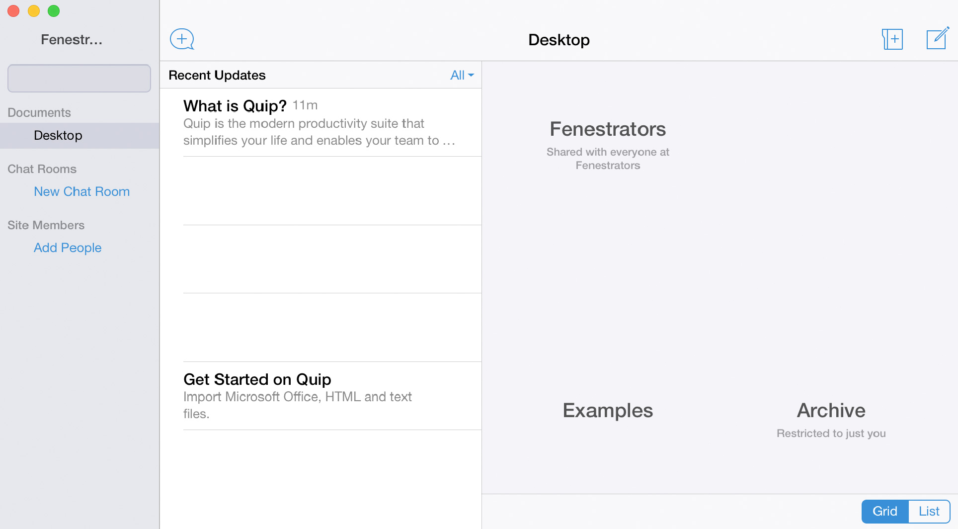
In a native app, none of the intermediate stages are visible, thus they have much of a “snappy” feeling when creating a new window. Incremental rendering is normally desirable on the web if waiting on resources that require a network round-trip. In this case the overall time is short enough that intermediate states which only appear for a few frames (such as the one shown below) are distracting rather than giving a sense of progress.

To avoid showing an entirely blank window (stage 1), instead of showing the window immediately, we modified the new window sequence to keep the window hidden until the ReactDOM.render() call for the application’s root view finished. This does mean that there is a slightly longer delay between the app being launched and the window appearing. However, since other things are happening (dock icon bouncing, menu bar changing), and the delay is on the order one to two hundred milliseconds, it's not noticeable.
The initial rendered view was very empty since it didn’t have any of the data for the user’s desktop or inbox. On the web we “seed” this data in the initial HTML response to avoid the extra network round-trip to fetch it. We had assumed that loading data from the local database is so fast that such an optimization was unnecessary, and instead it could be loaded on demand like everything else. It was indeed quite fast, but it still took tens of milliseconds, which led to frames that appeared incomplete. Once we added the same “seeding” capability to the desktop app (the request to render the initial object also included all the data necessary for the view), almost everything appeared at once, skipping over most of stage 3.
The reason why I said almost everything appeared at once is because some images were still taking a few extra frames to show up. The odd part was that these images were local static assets, and thus should have been readily available (e.g. the folder and sidebar icons in the screenshot above). Further, we inline the images as data: URIs into our main stylesheet (an optimization originally meant for the website, but carried over to the desktop app since it didn’t seem like it would hurt). Thus loading of the images should not involve any more I/O once the stylesheet was loaded and parsed. Evidently that was not the case — even when using data: URIs there was an asynchronous “fetch” and decompress step for rendering the image.
When experimenting with creating additional windows, we noticed that in those cases the images do appear instantaneously. We thus concluded that they must still end up in WebKit’s memory cache. We wanted to simulate this behavior for even the first window, and in the absence of an explicit cache hinting API, we added a “cache warmer” to invoke early on during application startup. It creates a WebView and loads a simple static HTML file that references our stylesheet and has dummy markup corresponding to our most common views. The view doesn’t need to be added to a window or otherwise shown, and it gets disposed of 10 seconds after startup.
Once all those changes are implemented no incremental rendering is visible (slowed down version). None of modifications that were necessary were particularly complex, but they do show the extra attention to detail that is necessary to get a hybrid web app to feel more native.
- During development I often end up taking screen recordings and then stepping through them frame-by-frame to get a better understanding of the rendering sequence. I usually use ScreenFlow, but QuickTime Player can do this too.
Post a Comment