Slack Canvas In The Streets, Quip In The Sheets #
I finally got access to the recently-launched Slack canvas feature. This project was the last thing I worked on before I left Quip/Slack/Salesforce in April of 2022, and I was curious how it had evolved since then.
Canvas started as a prototype in mid-2021 to reuse Quip technology to power a collaborative editing surface inside of Slack. The initial phase involved Michael Hahn and I doing unspeakable things with iframes1 to get the two large codebases to work together2 with minimal changes. This allowed a relatively rich feature set to be explored quickly, but it was not something that was designed to be generally available. At the time of my departure the work on productionizing (the second 90% of the project) had just begun.
The first thing that becomes apparent is that the roots of canvas in Quip are entirely hidden from the user — no Quip references in the announcement or anywhere in the UI. This makes sense from a “don’t ship your org chart” perspective — no user should care how a feature is implemented. However, if you peek under the hood, you can start to see the some Quip tidbits. The most obvious place to start is to look for network requests with quip in them — a couple of which happen when loading a Slack canvas:

The “controller” is the core logic of Slack canvas editor, and we if load one of those URLs, we see even more Quip references:

The DOM also resembles Quip’s, down to the same CSS class names being used. The need to scope/namespace them to avoid colliding with Slack’s was one of the open questions when I left, but I guess Slack has a BEM-like structure which ensures that Quip’s simpler class names don’t collide (as long as they don’t integrate another similar un-prefixed codebase). There are also no iframes in sight, which is great.

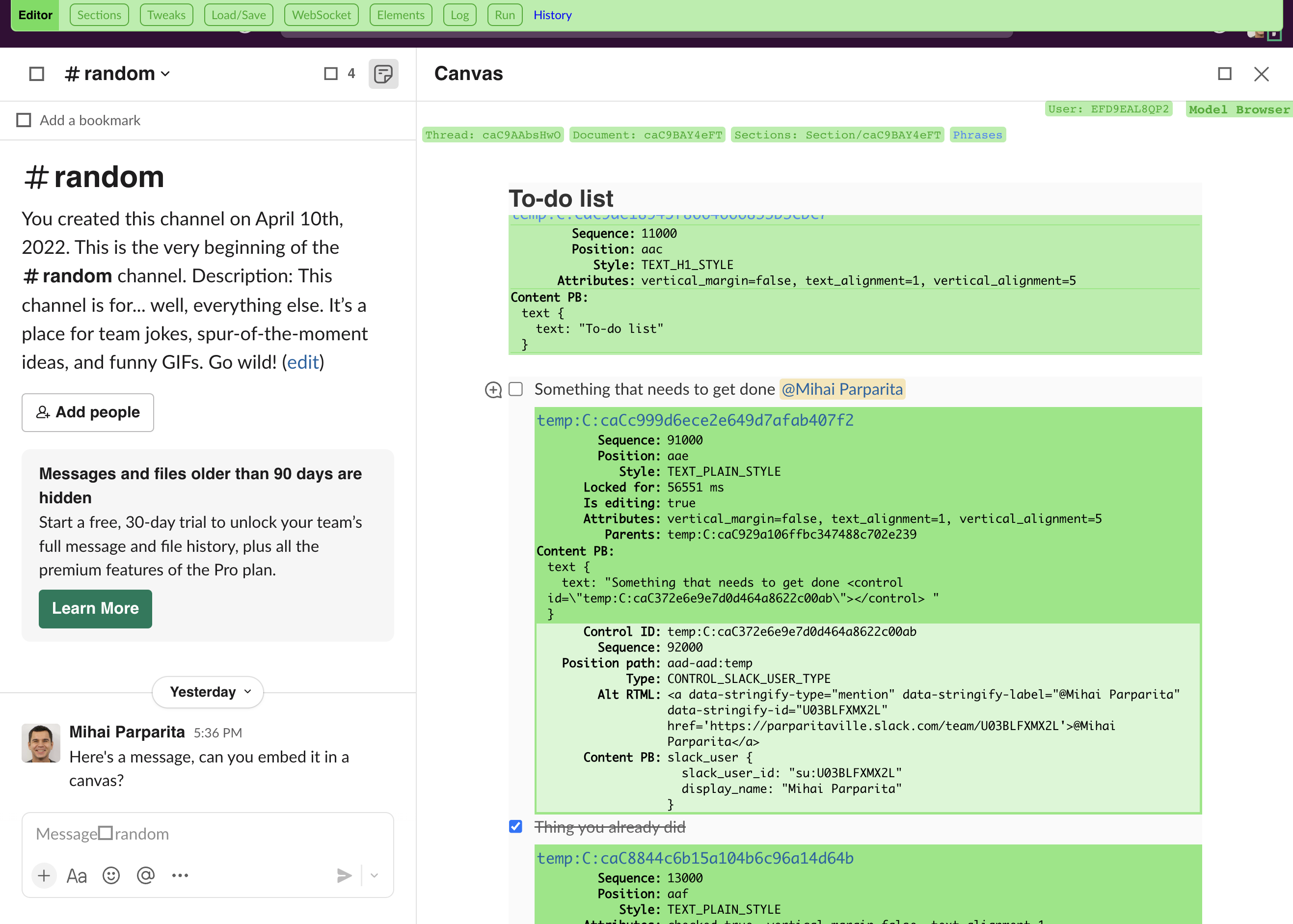
Quip also had extensive in-product debugging tools, and I was curious if they also made the transition to Slack canvas. They’re normally only enabled for employee accounts, but as hinted there is a way to enable them as a “civilian” user too. A couple of commands in the dev tools, and I was greeted by the green UI that I had spent so many years in:

I was also hoping that copying/pasting content from Quip into Slack canvas was a backdoor way to get some of features that have not (yet?) made the transition (spreadsheets, date mentions, etc.), but it does not appear to work.
On the mobile side, I had explored reusing Quip’s hybrid editing approach in the Slack iOS app, including the core Syncer library. Hooking up Console.app to an iOS device shows that the Syncer (and thus Quip) are still involved whenever a canvas is loaded.

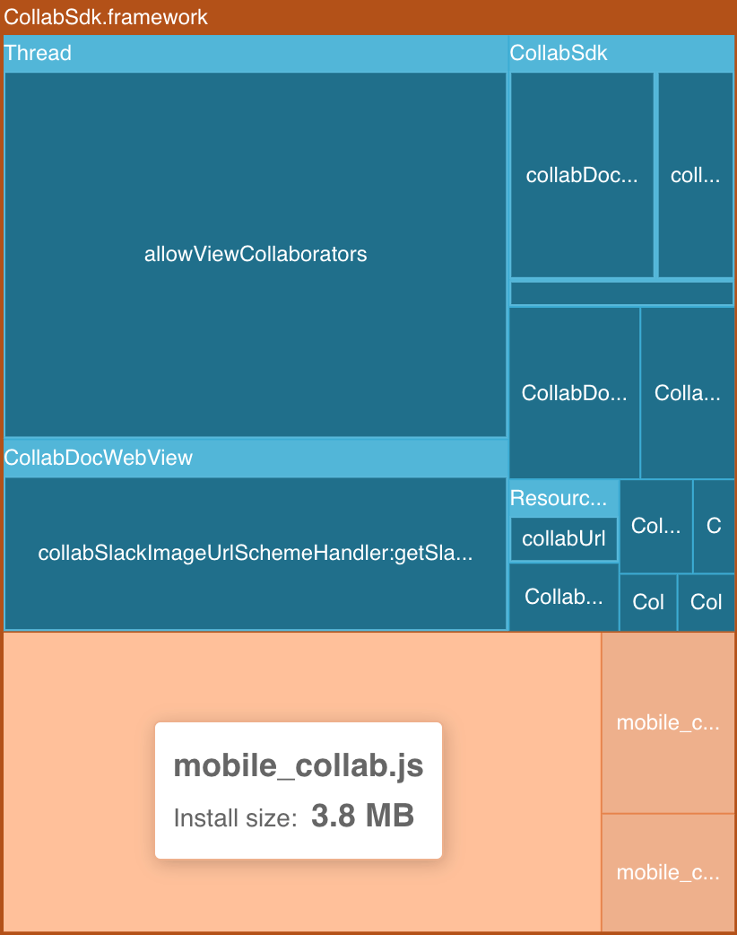
One of the open questions on mobile at the time of my departure was how to render Slack content that’s embedded in a document. Quip’s mobile editor is a (heavily customized) web view, so that we can reuse the same rendering logic on all platforms. It's possible to see that the canvas rendering is still web-based by inspecting the Slack app bundle (Emerge Tools provides a nice online tree view) – there is a mobile_collab.js file which implements document rendering:

Slack on the other hand is an entirely native app. Porting Quip’s editor to native components didn’t seem feasible on any sort of reasonable timeframe. It was also not appealing to reuse Slack’s web components on mobile, since they weren’t designed for that (either from a UI or data loading perspective). I had speculated that we could leave a “placeholder” element in the web view for Slack-provided UI (like a message card), and then overlay the native component on top of it. But I wasn’t sure if it would be feasible, especially when the document is scrolled (and the native view overlay would have to be repositioned continuously).
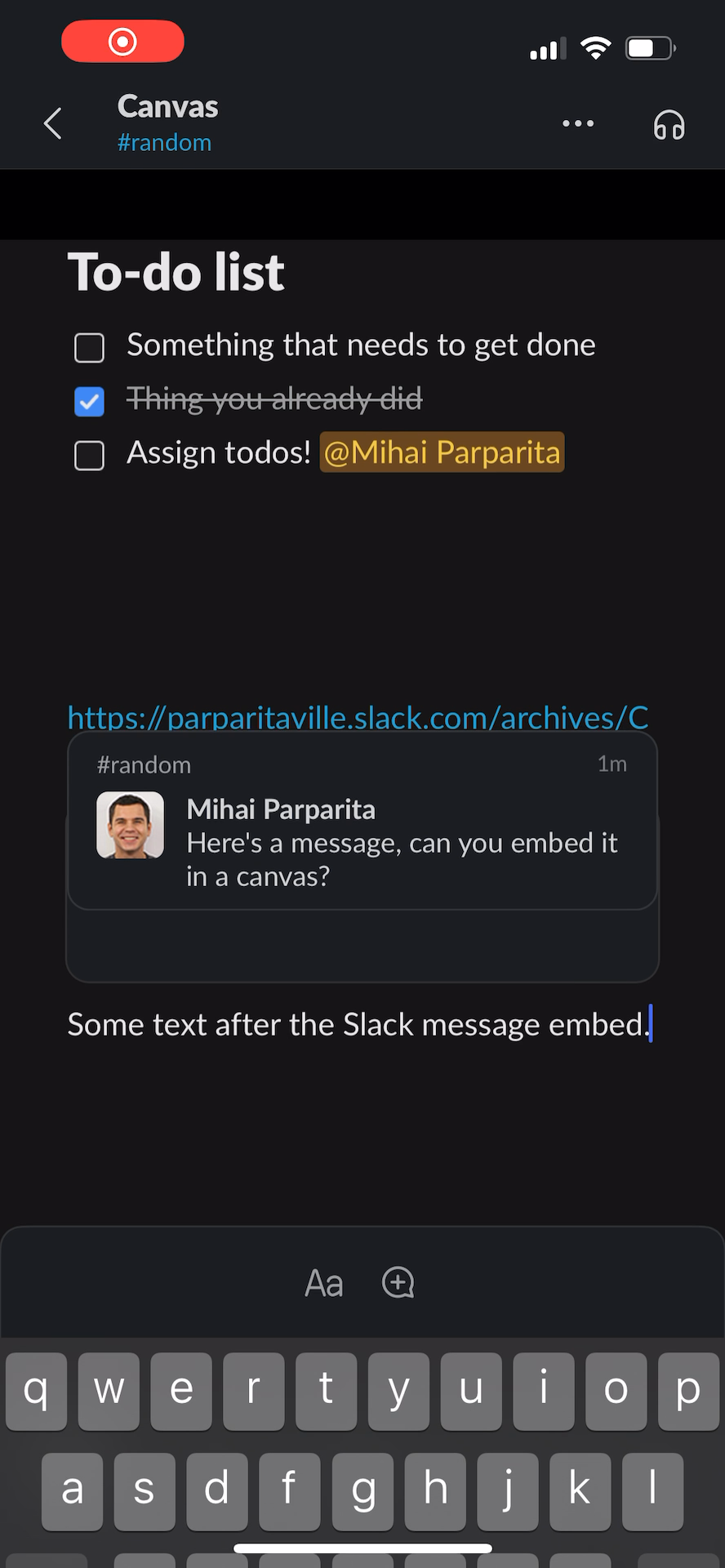
It’s not as easy to inspect the view hierarchy of an iOS app (without jailbreaking), so I can’t verify this directly, but it would appear that this placeholder/overlay approach was indeed chosen. Most of the time, the native Slack UI is positioned perfectly over the document. However, in some edge cases (e.g when a scroll is triggered because the keyboard is being brought up), things end up slightly out of sync, and the placeholder is visible:

|

|
This is my first time being on the outside of a project while significant work on it continued (unlike other times), and it’s been fascinating to observe. I congratulate all the people involved in shipping Slack canvas, and will cheer them on3.
- I later realized I had done the same thing 15 years earlier, getting Reader iframed into Gmail as another proof-of-concept.
- At one point we had slack.com iframing quip.com which in turn was iframing slack.com again (so that we could show Slack UI components inside documents), an architecture we took to calling “turducken.”
- Especially if they bring back syntax highlighting for code blocks.
Post a Comment